
Competitor Analysis Chart Guide to Visualize and Win

You've probably got the raw material already. A spreadsheet with competitor features. A slide with pricing screenshots. A few exported social posts. Maybe an SEO report with overlapping keywords and a Slack thread full of opinions about who the “real” competitors are.
And yet the team still can't answer the question that matters.
Should you reposition the product, change channel mix, adjust pricing, defend a segment, or ignore the noisy rival that keeps showing up in sales calls?
That's where most competitor analysis work breaks. The team gathers data, but never turns it into a competitor analysis chart that supports an actual decision. The result is a document that looks thorough, then goes stale, then gets reopened during planning season as if nothing changed.
The charts that hold up under scrutiny are narrower, stricter, and more auditable than most templates. They don't just compare features. They show who you're really up against, which dimensions buyers choose on, where the whitespace sits across segment, channel, and message, and what evidence supports each conclusion.
Table of Contents
- Why Most Competitor Analysis Charts Fail to Drive Decisions
- Define Your Competitor Set and the Question Your Chart Must Answer
- Choosing Metrics and Chart Types That Reveal Real Gaps
- Build Your Competitor Analysis Chart Without the Common Errors
- Examples Templates and Data Sources That Make Charts Actionable
- Keep Your Chart Accurate and Useful Over Time
Why Most Competitor Analysis Charts Fail to Drive Decisions
A leadership team is in the review meeting. Marketing brings a 40-row competitor matrix with feature checkmarks, pricing notes, and a few screenshots. The first question from the CMO is simple: where should we press next quarter? The chart cannot answer it.
That failure pattern shows up all the time. Teams collect what is easy to gather, then present it as if volume equals clarity. The output looks diligent and still leaves product, demand gen, and leadership arguing about the same choices they had before the chart existed.
The problem usually is not missing data. It is chart design.
Feature-heavy charts hide the gaps that matter
A feature table can support product comparison, but it breaks quickly when the actual decision is about position, audience, or go-to-market pressure. Buyers do not sort vendors by feature count in a vacuum. They compare fit, credibility, reach, and whether the offer makes sense for their team size, workflow, and budget logic.
That is why weak charts miss the whitespace. They track what competitors built, but not where competitors are underrepresented or inconsistent.
The gaps that change decisions are usually these:
- Segment gaps: Which customer size, industry, or maturity level each competitor is serving well, and which segment nobody is addressing clearly
- Channel gaps: Which acquisition channels competitors rely on, and where attention is available because the field is crowded in one place and thin in another
- Message gaps: Which claims each competitor repeats, which proof points support those claims, and where the category language has gone stale
- Evidence gaps: What is verified from public pages, what came from sales calls, and what is still an assumption
I have seen feature matrices pass around a company for weeks and still fail a basic leadership test: can anyone point to one market move the chart supports? If not, it is inventory, not analysis.
For a practical reference on turning side-by-side comparison into a decision tool, Captapi's guide to competitor analysis benchmarking frameworks is a useful companion to matrix work.
Static snapshots lose credibility fast
A competitor chart also fails when nobody can audit or refresh it.
One-time charts age badly because competitors change packaging, rewrite homepage copy, shift paid channel spend, launch partner motions, or move upmarket without much warning. Riddle Insights makes the same point in its review of why competitive analysis isn't working. Static documents decay faster than teams expect.
The fix is operational, not cosmetic. Keep source links at the row level. Stamp every entry with a capture date. Separate observed facts from interpretation. If a sales anecdote changes a position on the chart, log who reported it and what supporting evidence exists.
A competitor analysis chart should work like an audited operating document, not a planning-season artifact.
That standard changes what goes into the chart. Instead of stuffing in every possible field, useful charts force comparability and expose uncertainty. They show where the evidence is solid, where the market is shifting, and where the team is making a judgment call.
Good charts are built to support a decision under scrutiny
Competitive intelligence keeps getting more budget and attention, which means weak charts do not survive review for long (market sizing summary). Leaders will ask why a rival was included, whether two pricing models are comparable, and what proof supports a claimed message position.
Useful charts are narrower than teams expect. They leave whitespace on purpose. They make room for segment, channel, and message interpretation instead of filling every column with product trivia. And they stay editable, sourced, and time-bound so the team can revisit the same chart next month without starting from zero.
Define Your Competitor Set and the Question Your Chart Must Answer
A demand gen team pulls the five vendors that show up first on G2, fills a matrix with feature checks, and calls it competitive analysis. Two weeks later, sales keeps losing deals to an agency-plus-spreadsheet workflow that never made the chart.
That miss is common because competitor selection usually starts from category labels instead of the decision at hand. A useful chart starts narrower. It defines the question first, then includes only the companies, substitutes, and workarounds that can change that decision.
Start with one business question
A competitor analysis chart should answer one operational question cleanly.
Examples:
- Should we move upmarket or protect the mid-market base?
- Which rival owns the strongest partner-led distribution path?
- Are we losing deals on packaging, procurement friction, or message fit?
- Which buyer segment is underserved enough to justify a campaign, sales motion, or roadmap bet?
The question sets the boundary of the chart. A channel-planning chart needs distribution mix, partner presence, content formats, and message themes. A packaging chart needs pricing model, seat logic, free-trial structure, and upgrade friction. Mixing both into one matrix usually gives teams a crowded file with no clear answer.
Teams that still treat this work as a one-off research task usually benefit from aligning on the operating model first. Captapi's overview of what competitive intelligence is is a useful reference for that reset.
Separate direct competitors from alternatives and future threats
Feature similarity is a weak filter on its own. Buyers compare categories in messier ways than internal teams expect.
Use three buckets:
Direct competitors
Similar offer, similar buyer, similar evaluation criteria.Indirect alternatives
Different product shape, same job to be done. This often includes agencies, internal builds, spreadsheets, or adjacent tools.Emerging threats
Smaller vendors, adjacent platforms, or channel-native players that could shift buyer expectations within the next two quarters.
A martech team, for example, may list the five attribution tools everyone already knows and miss the warehouse-first product that wins because RevOps trusts the data model more. A social team may track only peer brands and miss that creators, media pages, or newsletter operators are absorbing the audience attention they wanted. That is why good charts leave whitespace for segment, channel, and message gaps, not just product columns.
One source on competitive-analysis blind spots points out recurring errors such as focusing only on current rivals, assuming competitor behavior stays fixed, and over-relying on public signals (SI Labs on competitive-analysis bias). The practical takeaway is simple. Add a field for “why this company is on the chart” and another for “what would make this competitor more relevant next quarter.”
Keep the set small enough to update and audit
The right number is the number your team can maintain without guessing. In practice, that usually means a shortlist.
Use a working set such as:
- The competitors sales hears in active deals
- One substitute or indirect option that can pull budget away
- One emerging player with a different distribution or message model
- Only companies you can compare fairly against the question you chose
This is also where I cut vanity inclusions. If a company is famous but irrelevant to the decision, remove it. If a rival serves a different segment with a different buying motion, tag it separately instead of forcing a bad side-by-side comparison.
If social visibility helps determine who belongs in the set, this roundup of tools to compare social media competitor tools is useful because it shows overlap, posting patterns, and engagement context across platforms.
Practical rule: if a company cannot affect the decision your chart is meant to support, it does not belong in the primary comparison.
Choosing Metrics and Chart Types That Reveal Real Gaps
Once the competitor set is right, the next mistake is defaulting to a giant table for everything. Tables are good for storage. They're not always good for insight.
Different questions need different visuals.
Start with metrics buyers and operators actually care about
Over-indexing on product features makes sense because features are easy to inventory. The bigger wins often sit elsewhere. One 2026 guide argues that whitespace should be examined across product, segment, channel, and message, and calls out underserved buyer types and overlooked distribution paths as common blind spots (guide to competitive analysis gaps).
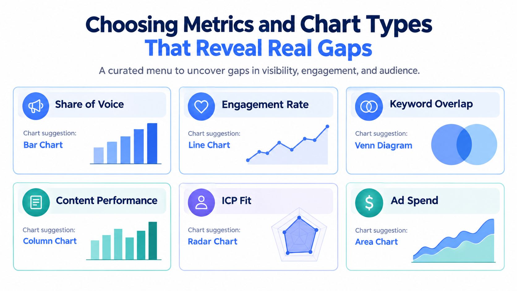
That means a practical metric set might include:
- Share of voice for category-level visibility
- Engagement rate or engagement quality for content resonance
- Keyword overlap for search head-to-head pressure
- Content performance by topic and format
- ICP fit for segment clarity
- Primary channel for distribution pattern
- Message theme for positioning consistency
If you need a broader visual design reference before choosing formats, Captapi's guide to data visualization methods gives a good framework for matching chart types to questions.
Match the metric to the visual
Here's the decision rule I use: pick the chart that makes the intended comparison easiest to see at a glance.
| Insight Needed | Best Chart Type | When to Use It |
|---|---|---|
| Share of voice across competitors | Bar chart | When you need straightforward ranking and easy stakeholder reading |
| Engagement over time | Line chart | When trend direction matters more than a single snapshot |
| Keyword overlap | Venn diagram | When the goal is to show shared and unique search territory |
| Multi-factor capability balance | Radar chart | When comparing strengths across a small set of dimensions |
| Engagement versus posting volume | Bubble chart | When you want to show output, response, and relative size together |
| Content topic performance | Heatmap matrix | When you need to spot topic-channel patterns quickly |
A few trade-offs matter:
- Bar charts are clean and executive-friendly, but they flatten nuance.
- Radar charts can work for small comparisons, but they become unreadable with too many variables.
- Venn diagrams are intuitive for overlap, but only with a small number of entities.
- Heatmaps are excellent for scanning, but they require normalized inputs.
- Bubble charts show relationship well, but weak labeling can ruin them.
Here's a useful tactic when the chart includes web competitors with different technical stacks. Before interpreting performance differences as pure strategy, check your site's tech stack and theirs. That context helps explain why some players publish faster, test more landing pages, or support richer content workflows.
Don't stack unlike metrics into one visual
Charts get misleading. Teams try to combine messaging, features, pricing, and channel data into one score, then argue about the weighting for a week.
Don't compress too early. Keep dissimilar dimensions separate until you know what decision needs a synthesis.
A short explainer can help if your stakeholders need to see examples before they buy into the design choices:
If the audience has to learn your chart before they can read your chart, you chose the wrong visual.
Real gaps are often outside the product
The strongest charts reveal asymmetry. One competitor may have weaker functionality but stronger message discipline. Another may serve a narrower ICP but own a channel your team ignores. A third may be average on both, yet consistently shows up because their distribution model is better.
That's why the useful question isn't “Who has the most features?” It's “Where is there space we can credibly win?”
Build Your Competitor Analysis Chart Without the Common Errors
Monday morning, the team is in a review meeting, and the chart on screen looks polished. Ten minutes later, the discussion stalls on basic questions. Why is annual contract pricing compared against monthly self-serve plans? Why does “strong social presence” sit beside hard product data as if they carry the same weight? Who captured the evidence, and when?
That breakdown is predictable. The chart failed long before the meeting.
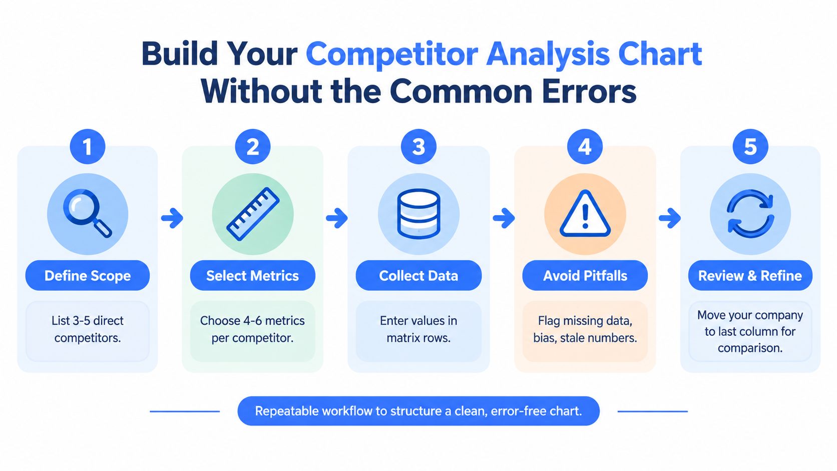
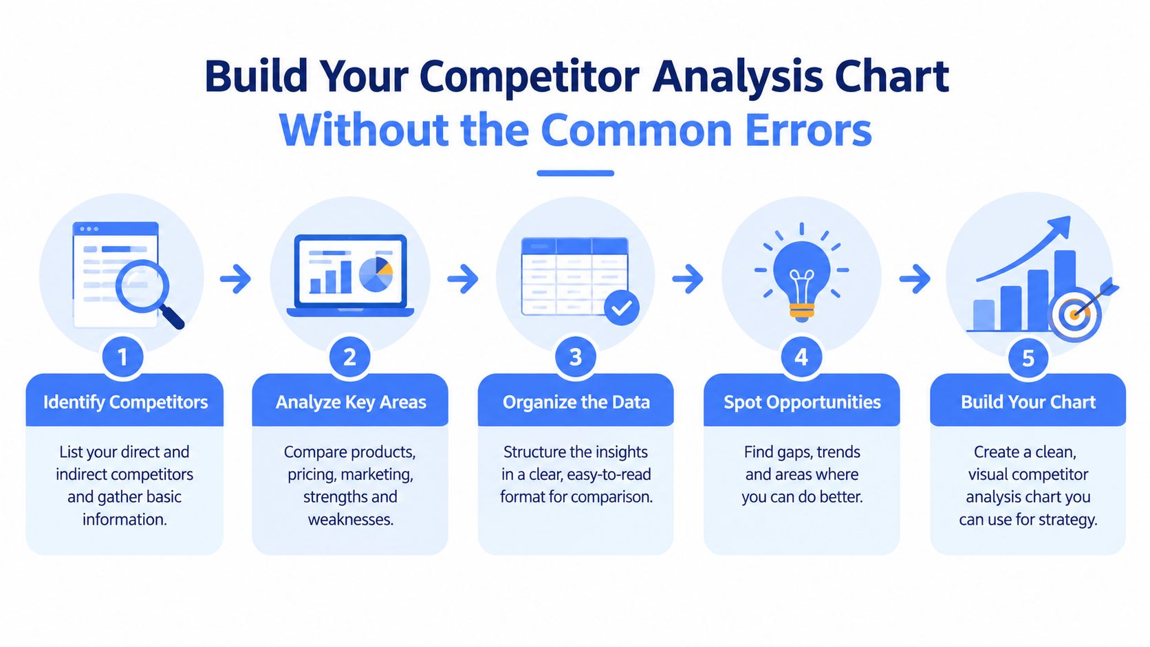
The build process matters more than formatting. Use the matrix shape defined earlier and focus here on how to fill it so the output supports a decision, survives scrutiny, and can be updated without starting over. The cleanest working method I use is straightforward: define the decision, collect only comparable fields, store dated evidence, normalize units before scoring, and mark unknowns clearly instead of filling gaps from memory or sales chatter (Anygen's competitor chart guidance).
Build for reading speed and auditability
A useful competitor chart has two jobs. It has to help a stakeholder spot the gap fast, and it has to let an analyst trace every conclusion back to evidence.
That changes how the sheet should be structured. I keep observed facts separate from interpreted scores, and I add columns that many teams skip:
- evidence source
- capture date
- segment served
- primary channel
- core message
- confidence level
- notes on comparability
Those fields matter because the whitespace is often outside the product. A rival may look average on features but dominate a segment you barely address. Another may target the same buyer with a different message and win through channel fit. If the chart only records feature presence, those openings disappear.
If you need to turn the working sheet into something leadership can scan in two minutes, Captapi's guide on how to build dashboards for reporting layers is a useful reference for separating analyst detail from stakeholder views.
Keep scores secondary to evidence
Scores help with comparison. They also create arguments if the basis is hidden.
Use scoring only after the raw fields are stable. A simple shared scale works fine if every score points back to a note, source, and date. Without that trail, the chart becomes opinion disguised as structure.
I use two adjacent rows or fields when the topic is subjective:
Observed evidence
Example: homepage headline, CTA pattern, pricing model, review themes, paid search presenceAnalyst interpretation
Example: message clarity, channel strength, onboarding friction, segment fit
That separation sounds tedious. It saves time every time someone asks why Competitor C received a higher mark than Competitor B.
Normalize the inputs before anyone compares them
Bad competitor charts usually break on comparability, not effort.
Common failures include comparing enterprise custom pricing against listed SMB tiers, using engagement totals for one brand and engagement rate for another, or mixing current messaging with screenshots captured six months apart. The fix is simple. Convert to the same unit, use the same time window, and note the assumption used.
If you cannot normalize a row fairly, split it. “Pricing” often needs separate rows for entry point, billing model, and sales involvement. “Content strength” usually needs to be broken into output volume, topic coverage, and distribution channel. One blended row hides too much.
Treat missing data as part of the analysis
Blank cells are useful if they are honest.
Label the value Not stated, Could not verify, or Not applicable. Those labels reveal different realities. “Not stated” may show deliberate message ambiguity. “Could not verify” flags a research gap. “Not applicable” prevents false equivalence between business models.
I also recommend a short note for every uncertain field. Public evidence is selective, especially in categories where packaging changes often or sales-led teams disclose little on the site. A chart that signals uncertainty is more credible than one that pretends every cell is complete.
Build bias resistance into the sheet
Competitor charts drift when the team changes, the category shifts, or one loud opinion starts shaping the scoring. Prevent that in the structure itself.
Use a few operating rules:
- apply the same evidence standard to every competitor
- record who updated the row
- add a last-verified date
- keep assumptions in a dedicated notes field
- separate current-state data from scenario notes such as upmarket expansion or new channel entry
This is how a chart stays dynamic instead of becoming a one-time workshop artifact. The goal is not a beautiful snapshot. The goal is a working record that shows where you can win by segment, by channel, and by message, and that still makes sense three updates later.
What survives review is usually plain. Clear fields. Comparable units. Visible dates. Honest gaps. Evidence first, interpretation second. That is the version teams keep using.
Examples Templates and Data Sources That Make Charts Actionable
A competitor analysis chart becomes useful when the data source matches the question. Most weak charts break because the team uses one source for everything, usually the website.
That only covers what the company says about itself.
Four chart patterns worth reusing
I come back to the same few structures because they answer different questions cleanly.
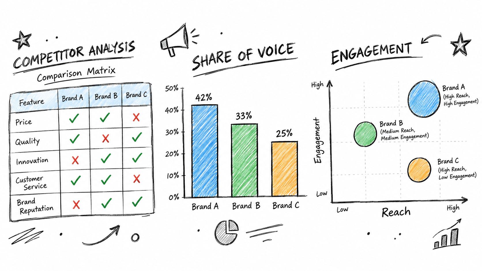
Comparison matrix
Use this as the master sheet. It stores normalized fields, source notes, dates, and a compact score where needed. This is the operational layer.
Share of voice bar chart
Use this when leadership wants to see relative visibility without reading a spreadsheet. Keep it simple and time-bound.
Engagement bubble chart
Use this when one competitor posts constantly but gets weak response, while another posts less and gets stronger interaction. This chart is good at exposing output versus reaction.
Keyword overlap Venn
Use this when search competition is confusing. It quickly shows whether you're facing direct overlap or whether competitors win on adjacent territory.
Match sources to the chart, not the other way around
The right source depends on the field.
Social performance and content cadence
Pull public post data, captions, transcripts, comments, and engagement metrics from the platforms competitors use.Keyword overlap and search territory
Use SEO tooling and manual SERP review to confirm whether overlap is real or just tool noise.Content performance
Audit topic clusters, content formats, publishing consistency, and message repetition.Pricing and packaging
Capture from public pricing pages, sales materials you can legally access, and dated screenshots.
For social and content sourcing, one practical option is Captapi, which provides one REST interface for public YouTube, TikTok, Instagram, and Facebook data, including transcripts, summaries, comments, engagement metrics, and search results. That's useful when you want structured JSON for dashboards instead of manually exporting from several platform-specific tools.
The best template in the world won't help if every row comes from a different level of evidence quality.
Use templates that preserve auditability
The most effective templates include more than comparison cells. They also include:
| Field | Why It Matters |
|---|---|
| Source URL or source label | Shows where the claim came from |
| Capture date | Prevents stale comparisons from masquerading as current |
| Normalization note | Explains how units were aligned |
| Missing value marker | Distinguishes unknown from zero |
| Interpretation note | Keeps analyst judgment separate from observation |
That last field matters more than many teams realize. It's where you note things like “strong founder-led distribution” or “message unclear across homepage and ads” without pretending those are raw facts.
Don't ignore unconventional sources
Whitespace often shows up first in places feature matrices never touch. Community channels, niche events, creator partnerships, founder content, and retail shelf behavior all reveal positioning signals.
If you analyze ecommerce or retail competition, specialized collection methods can help. For example, a Walmart scraping API can support structured category, pricing, listing, or assortment analysis when the chart needs retail evidence rather than pure marketing signals.
What makes examples actionable isn't how polished they look. It's whether someone else can reproduce the same finding from the same source and reach roughly the same conclusion.
Keep Your Chart Accurate and Useful Over Time
Monday's pricing review starts, and someone is still arguing from a homepage screenshot captured six months ago. Another teammate is quoting a channel strategy that disappeared after the competitor cut its partner program. At that point, the chart is no longer helping the decision. It is preserving old beliefs.
A competitor analysis chart stays useful only if it has a refresh cadence, an owner, and an audit trail. For fast-moving categories, I usually set two clocks. Core fields such as pricing, packaging, active channels, and primary message get checked on a fixed schedule. Event-driven fields get updated when something changes in the market, such as a new segment launch, a category entry, a rebrand, or a shift in ad creative.
Build a refresh routine people will actually follow
The routine should be light enough to survive a busy quarter and strict enough to catch drift.
Use a simple maintenance pass:
- Replace expired evidence when the live page, ad, listing, or profile no longer matches the entry
- Review competitor coverage so new entrants, substitute products, and fast-growing niche players do not stay off the chart
- Update whitespace notes for segment, channel, and message gaps, since those usually change before feature sets do
- Log what changed with date, source, and analyst name so future edits are traceable
- Separate fact from interpretation by updating observations and judgment in different fields
If the chart feeds recurring reporting, treat it like an operating asset rather than a slide. Basic controls from a data quality assurance process help prevent stale rows, broken source references, and inconsistent scoring.
Watch for confidence drift
Confidence drift shows up in very specific ways. The same screenshot survives three refresh cycles. A “mid-market” label stays in place even after the competitor starts selling upmarket. Nobody questions a blank channel field because the row looks familiar.
Those are maintenance failures, not research failures.
The fix is to force review at the point where charts usually go stale. Add a “last verified” field. Flag records that have not been checked within the agreed window. Require a note when a score stays unchanged through multiple reviews. That note should answer a practical question: did nothing change, or did nobody look closely enough?
A quick pre-share check keeps the chart credible:
- Does each non-obvious claim point to current evidence?
- Did someone verify segment, channel, and message fields, not just features and pricing?
- Are unchanged scores explicitly revalidated rather than carried forward by habit?
- Can another analyst reproduce the conclusion from the cited source?
- Does the chart show open questions and unknowns instead of implying certainty?
Captapi fits this workflow when the chart depends on public social and video data that needs repeated collection, normalization, and delivery into dashboards or analysis pipelines. If you're tracking competitor content, engagement, transcripts, comments, or platform search results across major social networks, visit Captapi to see how its unified API can support a more auditable competitor analysis process.