
Competitor Analysis Benchmarking That Actually Works

Monday's stand-up starts with a familiar problem. The SEO dashboard says one competitor owns the category, the social listening report says another does, and the paid media view produces a third version of “market share.” Everyone has a chart, but nobody trusts the comparison enough to make a decision.
That's the failure of competitor analysis benchmarking when it's treated as a quarterly presentation. Brand-level averages hide the query, page, audience, and use-case cohorts where competitive pressure appears. Tool defaults dictate the KPIs, loud social accounts become the competitor set, and the final report gets saved in a folder that nobody opens again.
A useful benchmark works differently. It ties each comparison to a business question, uses matched cohorts, labels every source, and creates a repeatable operating cadence. The approach below addresses the failure points directly, including the data layer, the dashboard, and the response process. For broader context on how structured comparison differs from casual observation, this competitor analysis guide is a useful companion, while competitive intelligence provides the wider discipline around market signals and decision-making.
Table of Contents
- Why Most Competitor Benchmarking Quietly Fails
- Framing the Right Business Questions and KPIs
- Building Comparison Cohorts That Actually Match
- Normalizing Metrics So Comparisons Stop Lying
- Pulling Benchmark Data Through a Social Data API
- Turning Numbers into Reports and Dashboards
- Running Benchmarking as an Operating Habit
Why Most Competitor Benchmarking Quietly Fails
The problem usually surfaces before anyone mentions methodology. A marketing lead asks why the brand lost visibility in a priority category, and three analysts open three dashboards. One dashboard uses a broad industry keyword set, another counts social mentions, and the third mixes paid and organic visibility. Each one displays a different market-share figure for the same competitors.
Nobody has necessarily made a calculation error. The dashboards are answering different questions while using the same label.
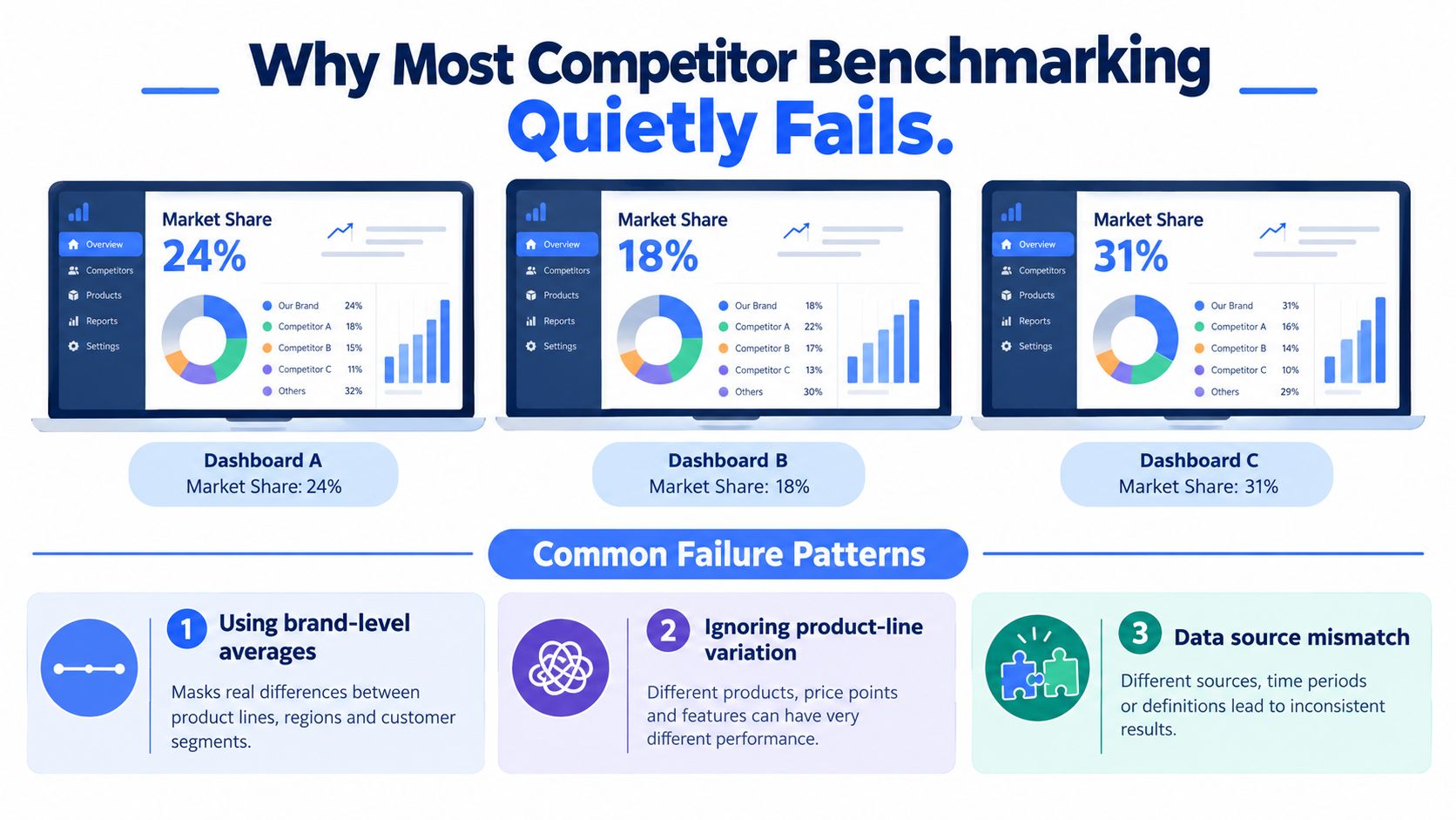
The report looks precise, but the comparison is loose
The standard failure pattern has four parts:
- Brand-level averages: Averages across every product, query, and audience flatten the places where a competitor is strong or weak.
- Tool-default metrics: Teams inherit whatever a platform makes easy to export, even when the metric doesn't map to a decision.
- Noisy competitor selection: The set is built from familiar brand names or whoever appears most often in a social feed, not from audience and offer overlap.
- Static reporting: Analysts produce a polished deck, stakeholders discuss it once, and the underlying benchmark remains untouched until the next planning cycle.
This creates false confidence. A brand may look competitive overall while losing the exact queries that influence product discovery. A rival may appear dominant because it publishes frequently, even though its content attracts little meaningful discussion or action.
Practical rule: If a dashboard can't tell you which query, page, audience, or use case created the gap, it isn't yet a decision tool.
The historical development of benchmarking helps explain why this happens. Independent accounts place early business benchmarking attempts in the early 1800s, while another classic milestone occurred in 1912, when Henry Ford studied Chicago meatpacking operations and adapted conveyor-like workflow for automobile manufacturing. Xerox later coined the term “benchmarking” in 1979, and the method reached widespread U.S. use only in the late 1980s, according to this history of benchmarking. The practice evolved from observation into process redesign, but many modern reports still stop at observation.
This article takes the operational view. The benchmark should be narrow enough to explain a gap, stable enough to reproduce, and live enough to change what a team does this week.
Framing the Right Business Questions and KPIs
Start with the decision, not the dashboard. “How are competitors performing?” is too broad to produce a useful benchmark. “Where are we losing visibility among comparison shoppers for this product category?” gives the analyst a boundary, a cohort, and a reason to collect data.
Three question families cover most practical competitor analysis benchmarking work:
- Where are we losing share? Look at visibility, mentions, search presence, and the pages or posts associated with the gap.
- Which content angles are working? Compare themes, claims, formats, and audience reactions rather than counting output alone.
- How fast is attention shifting? Track changes in conversation, competitor publishing, engagement quality, and emerging queries.
Build a competitor set from overlap
A default tool list isn't a strategy. Start with competitors that share the relevant audience, need, and offer. Include direct alternatives, indirect solutions, and emerging names only when they appear repeatedly inside the query or conversation cohort being measured.
The workflow should stay deliberately compact. The practical guidance is to limit the set to 3 to 5 real competitors, select 10 to 15 metrics, cover at least three categories, normalize the measurements, and turn gaps into actions only after the comparison is aligned, as outlined in this competitor benchmarking workflow.
Choose metrics that answer the question
Discovery metrics show whether people encounter a brand. Engagement metrics show whether the message creates a response. Conversion-adjacent signals help connect attention to commercial intent, although public competitor data will rarely provide a complete funnel view.
Raw follower counts and total impressions are common vanity traps. They can provide context, but they don't explain whether a competitor owns a relevant conversation or whether its audience takes a meaningful next step. Teams looking for a broader measurement vocabulary can use this guide to content performance metrics, then keep only the measures that support the stated decision.
| Business question | Metric | Category | Review cadence |
|---|---|---|---|
| Where are we being discovered? | Query-level share of voice | Discovery | Weekly |
| Which competitor owns the conversation? | Mention share by cohort | Discovery | Weekly |
| Are people responding to the angle? | Comment depth | Engagement | Weekly |
| Are posts prompting distribution? | Save and share rate | Engagement | Weekly |
| Is attention moving toward a brand? | Branded search movement | Conversion-adjacent | Weekly or event-led |
| Are audiences leaving the platform? | Click-outs where available | Conversion-adjacent | Weekly |
| Which pages support the winning intent? | Page-level visibility and internal-link coverage | Discovery | Monthly |
| How quickly can we react? | Signal-to-action latency | Operational | Weekly |
The table isn't a shopping list. Pick the measures that answer the original business question, document their definitions, and remove anything that doesn't influence prioritization.
Building Comparison Cohorts That Actually Match
Comparing companies by name is the fastest way to create a misleading report. A diversified brand may sell into several unrelated needs, while a specialist competitor may dominate one narrow use case. Putting both into a single average treats irrelevant activity as evidence.
A comparison cohort should represent a shared intent, topic, or audience. The unit of analysis might be a query cluster, a page group, a customer segment, or a recurring social conversation. This shifts the question from “Which company is larger?” to “Which domains or brands repeatedly win this specific opportunity?”
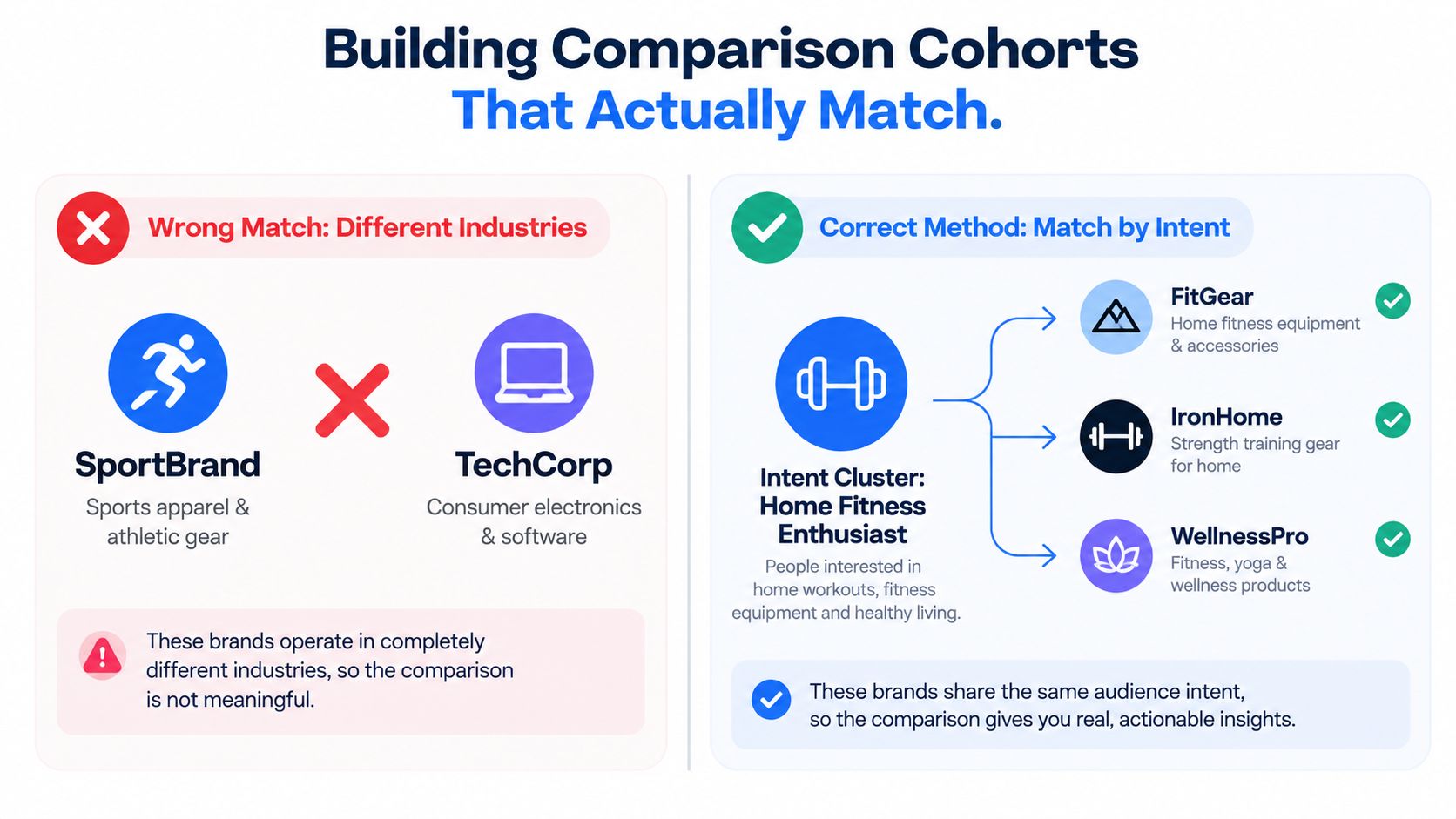
Three useful cohort types
Topic cohorts group conversations around a defined subject, such as “home workouts under 20 minutes.” The analyst can compare the content themes, claims, formats, and pages that attract attention inside that topic without letting unrelated product lines distort the result.
Audience cohorts describe who is making the decision. “First-time buyers in metro markets” may respond to proof, onboarding, or price clarity in ways that established customers don't. Audience signals can come from public comments, query language, community context, and internal customer research.
Intent cohorts capture the stage or purpose behind the interaction. Comparison shoppers, problem-aware researchers, and existing users should not share one benchmark because their expectations and language differ.
Weight presence by relevance
A simple mention count gives every item equal importance. Weighted share of voice is more useful because it gives greater influence to the cohort members that own more of the relevant conversation, while still preserving the underlying observation count.
The weight should be based on the share of conversation or query relevance within the defined cohort, not on general brand size. Keep the formula and inclusion rules visible to stakeholders. If a leader appears to dominate only because it has more unrelated content, the benchmark should make that limitation obvious.
Misaligned cohorts create three predictable outcomes:
- Inflated gaps: Your brand appears behind because irrelevant competitor activity has been included.
- False leaders: A large company ranks first even though a specialist wins the actual use case.
- Rejected recommendations: The planning team recognizes that the comparison doesn't match its market and stops using the report.
The strongest cohort definitions are narrow enough to explain why a page or message wins, but broad enough to contain recurring signals. Revisit the membership when query behavior, product scope, or audience language changes. Don't freeze a cohort merely because the old definition makes trend lines easier to compare.
Normalizing Metrics So Comparisons Stop Lying
A competitor can appear to win because its launch post falls inside your reporting window while yours does not. Raw figures become comparable only after the team defines how it will handle time, source, audience, amplification, and low-volume signals before building the first chart.
Set one shared time window for every row. An ISO week or another documented calendar convention works, provided the rule stays consistent. Record collection date separately from publication date. A trailing window and a fixed calendar period can produce different conclusions when a competitor publishes around a launch or seasonal event.
Write the rules as a normalization specification, then version them. It should settle these decisions:
- What counts as engagement? Keep likes, comments, saves, and shares separate, or map them to a combined unit. If combined, document the conversion rule rather than hiding it in a spreadsheet.
- What counts as reach? Separate active or observed reach from a platform's potential audience estimate. Public data cannot always resolve the difference, so retain that limitation as metadata.
- What counts as organic activity? Separate visible organic activity from boosted or paid amplification where the source allows it. If the source cannot distinguish them, mark the row as unresolved.
- What counts as a comment? Decide whether replies are included, and use thread and parent identifiers so exports do not count the same conversation twice.
- What counts as a share? Keep native reshares distinct from screenshot reposts or secondary mentions when platform data supports that distinction.
A brand-level average can hide the reason a query or page cohort moved. Store the normalized value alongside its raw count, cohort identifier, source, and definition version. That lets analysts compare like with like while still investigating the posts, pages, or queries behind a change.
Every metric also needs a source label and refresh method. Record platform, query, language, country, collection date, time window, and definition version. The data quality assurance guidance applies here because benchmarks weaken when definitions drift or inferred values sit beside direct observations without a clear label.
| Metric pitfall | Normalization rule | Signal lost if skipped |
|---|---|---|
| Different reporting windows | Align rows to one documented calendar period | Direction and timing |
| Potential audience mixed with active reach | Store reach type as a separate field | Engagement efficiency |
| Paid and organic activity combined | Tag amplification status or mark it unknown | Content effectiveness |
| Replies counted as independent comments | Preserve thread and parent identifiers | Conversation depth |
| Native shares mixed with reposts | Classify the distribution event | True propagation |
| Small cohorts ranked by percentage swings | Show volume and confidence flags beside the rate | Stability of rank |
| Source metadata removed in export | Retain platform, query, language, and country | Reproducibility |
Treat low-volume competitors and narrow query cohorts cautiously. A small change can create a dramatic percentage movement without indicating a durable shift. Show the underlying volume, flag unstable comparisons, and review the cohort before presenting a ranking as a decision signal.
A benchmark without definitions is a collection of opinions with decimal places.
Pulling Benchmark Data Through a Social Data API
A benchmark fails before the dashboard if its collection logic changes from one run to the next. A unified social data API can place public transcripts, comments, engagement fields, page details, and search results inside one cohort model, reducing reconciliation across separate scrapers and platform exports.

Start with the question, then map the evidence required to answer it. A query graph should connect each business question to a repeatable set of requests:
- Search queries find recurring domains, creators, pages, and adjacent competitors within a defined intent cluster.
- Content or transcript requests show topic coverage, claims, terminology, and format patterns.
- Comment requests surface objections, praise, confusion, and language differences across cohorts.
- Engagement requests provide the fields for normalized interaction measures.
- Page or channel details add publishing context and account attributes.
Captapi is one option for this workflow. Its REST interface provides public social data across YouTube, TikTok, Instagram, and Facebook, including transcripts, summaries, comments, engagement metrics, details, and search results. Teams assessing implementation patterns can review this social media API before deciding whether a unified interface fits their stack.
A collection run should use the same query, platform rules, and historical window for every competitor. Paginate with rate-limit awareness, deduplicate by content identifier, and write responses to a thin warehouse table keyed by source and date. Keep raw responses for audits, while analysts work from a normalized view.
Data-layer rule: Tag ambiguity instead of deleting it. An unresolved paid-status field is more useful than a silently filtered row that changes the ranking.
An API cannot resolve private accounts, expose inaccessible data, or clean every form of boosted amplification. Store those limitations in row metadata. Removing difficult observations can tilt the cohort toward whatever is easiest to scrape.
The storage model must preserve the link between an observation and its interpretation. A useful row can include competitor, platform, query cohort, content ID, publication date, collection date, language, country, engagement fields, amplification status, and definition version. The team can then refresh the benchmark without rebuilding its logic whenever a platform changes its interface.
Run this process as a live signal feed, not only as a reporting exercise. A new comment cluster, a burst around a competitor claim, or a recurring domain can enter the review queue before the next formal report. That cadence keeps query-level and page-level changes visible even when brand-level averages remain stable.
Turning Numbers into Reports and Dashboards
A benchmark earns attention when it changes a decision during a meeting. The report should show which query or page cohort moved, how wide the gap is, what evidence supports it, and who owns the response. Brand-level averages can hide the signal that matters.
Build the report around a gap matrix, then give it enough context to support action. Place selected KPIs against matched competitors or cohorts. Each cell should include the current position, prior period, direction of change, and a confidence or data-quality flag. Link every material gap to the page, topic, query, or audience segment that produced it.
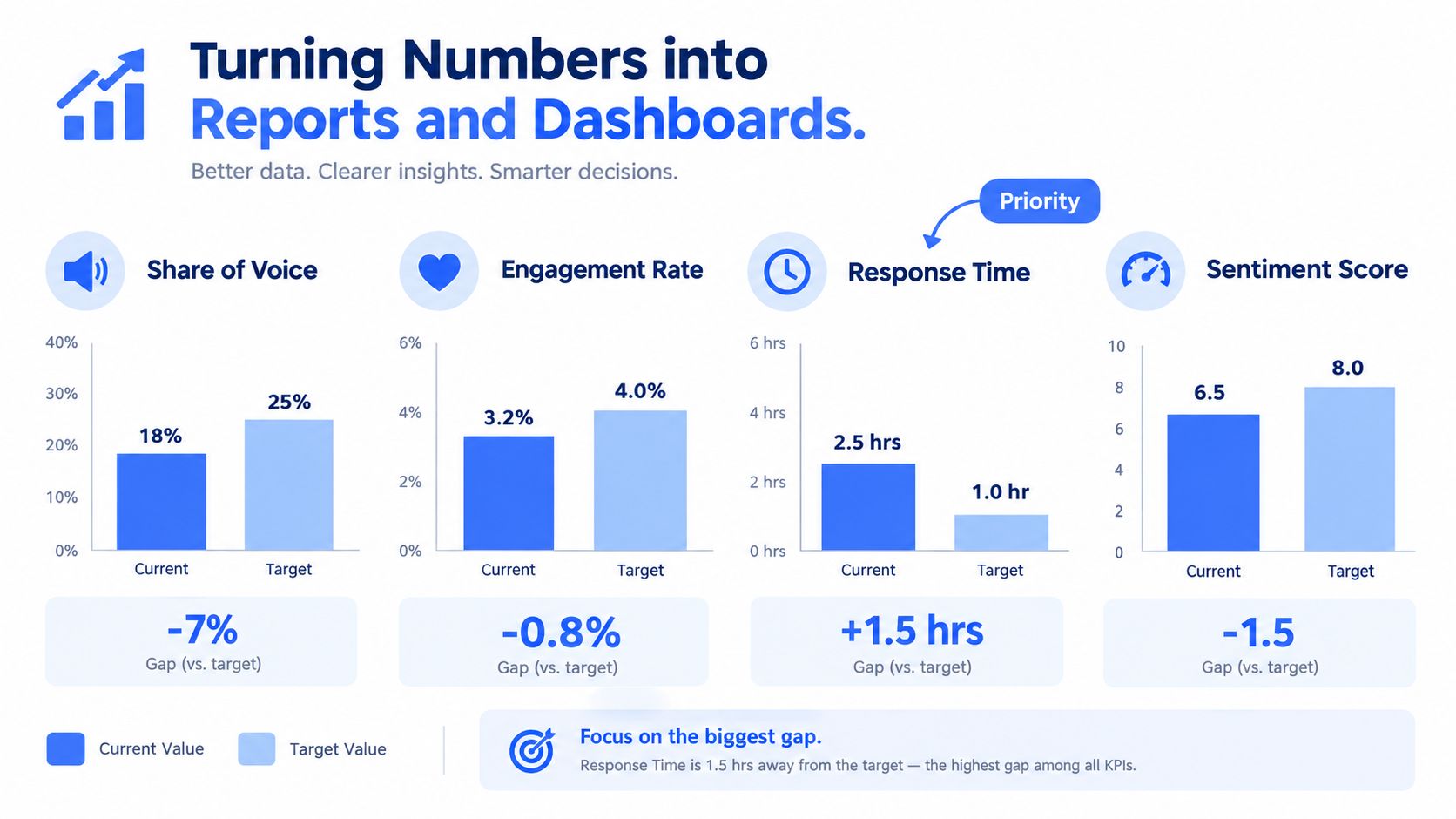
Rank gaps by decision value
A gap deserves attention when it points to a specific action. A visibility shortfall on a low-intent query may matter less than a smaller deficit in a commercial comparison cohort. High engagement on a competitor page may also be irrelevant if the interaction comes from an audience outside your target segment.
Use three focused views:
- Gap-over-time chart: Shows whether the relative position is widening, narrowing, or fluctuating.
- Cohort share-of-voice tile: Shows the current distribution for one defined intent or topic set.
- Alert feed: Surfaces new pages, content clusters, unusual conversation shifts, and unresolved data-quality issues from the unified social signal feed.
Add signal-to-action latency, the time between an outlier appearing and a response being logged. That measure exposes whether the reporting process supports decisions or merely records them. A team can detect a shift quickly and still gain nothing if no owner is assigned.
Teams formalizing the reporting layer can use this guide to build dashboards around clear data and decision requirements. Keep the presentation lean. If executives need an analyst to explain every tile before identifying the priority gap, the dashboard contains more detail than the meeting can use.
Remove an element when it no longer changes a decision, duplicates another view, relies on an unstable definition, or attracts attention only because it looks impressive. Archive its logic and historical output. Keep the active view focused on current cohort movement and the response it should trigger.
Running Benchmarking as an Operating Habit
A benchmark becomes useful when people consult it before making a decision, not when an analyst finishes it. The operating model should create shared definitions first, recurring interpretation second, and automation only after the team understands which signals deserve action.
The first 30 days establish trust
Lock the KPI set, cohort definitions, source labels, and normalization rules. Capture a baseline snapshot through the chosen data pipeline, then have the teams that will use the benchmark inspect the rows behind the summary. Marketing, SEO, social, product, and sales shouldn't each maintain a private version of the competitor set.
The first month is also the right time to document exclusions. Record which platforms, languages, countries, account types, and paid-status fields aren't comparable. A transparent limitation is easier to manage than an unexplained number that stakeholders later discover is incomplete.
Days 31 to 60 create the ritual
Use a recurring review pattern that gives each day a job:
- Monday diff report: Flag changed rankings, new competitor pages, unusual content clusters, and cohort outliers.
- Wednesday cohort refresh: Review query membership, emerging domains, audience language, and stale classifications.
- Friday narrative note: Have the analyst explain what changed, why it matters, what remains uncertain, and which owner should respond.
The narrative note is essential. Dashboards show movement, but analysts connect movement to decisions. They should state when the evidence is weak, when a change is isolated to one platform, and when a competitor's apparent gain comes from a changed definition rather than market behavior.
Days 61 to 90 add controlled automation
Automate alerts only after the team has observed enough cycles to distinguish useful signals from noise. Possible triggers include a meaningful share-of-voice decline within a defined cohort, a new competitor content cluster, or a sudden change in comment themes. The threshold belongs in the benchmark specification, and the alert should include the evidence and an owner.
The single most valuable view is usually a cohort-versus-cohort gap matrix with a 14-day delta, provided that window matches the team's operating needs and the data is consistently collected. Everything else should justify its place by changing a decision.
Watch for signs of decay:
- Vanity metrics return: Follower totals and raw impressions replace intent-level measures.
- Cohorts freeze: New queries, pages, and audience segments never enter the model.
- Dashboards go unopened: The report exists, but no meeting or owner uses it.
- Decisions lose the evidence trail: Teams act on memory or loud anecdotes instead of the benchmark.
- Definitions drift: The same KPI changes meaning between review cycles.
Competitor analysis benchmarking works when the organization treats comparison as an operating habit. The benchmark should tell people what changed, where it changed, how confident they should be, and what action deserves attention next.
Captapi can provide a unified REST interface for collecting public social search results, transcripts, comments, summaries, engagement fields, and page or channel details for repeatable competitor cohorts. Visit Captapi to evaluate whether its API fits your benchmark pipeline, then start by automating one defined query cohort and one recurring review workflow.